by Exploristics Chief Data Scientific Officer Kimberley Hacquoil
Humans are visual beings with an image being processed around 60,000 times faster than any form of text. It’s therefore not surprising that effective visualisations are a vital way to relay information related to clinical development and decision-making in the healthcare setting. But what does “effective” mean in this sense? I’m sure you are aware of the saying “a picture is worth a thousand words”, if that’s true then I wonder how many an interactive visualisation is worth?!
What is an interactive visualisation?
An interactive visualisation is the use of tools and processes to produce a visual representation of data which can be explored and analysed directly within the visualisation itself. They utilise cutting-edge technological advances and are the next step in terms of visual innovations. It’s a vibrant new form of communication and allows people to not only present compelling messages but also interact dynamically with the audience to ensure information is effectively conveyed to guarantee a deeper understanding. Working in this way allows people to adapt and adjust as more information is presented and linked together. This different approach gives people an opportunity to uncover new insights and investigate information in a collaborative way.

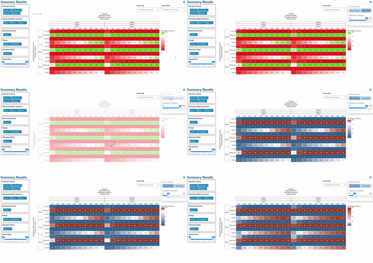
Example of customising appearance to improve accessibility (red-green colour blindness)
Why are interactive visualisations beneficial?
- It’s far easier to identify trends, correlations, and connections between data via well-designed interactive visualisations. By combining data in a meaningful way, the brain will find it less demanding and quicker to process the information and make decisions. Interactivity can allow users to filter, highlight and link elements. This is especially useful when trying to digest and make sense of large datasets (like we often do in the healthcare sector).
- Interactive analysis empowers users to answer critical questions on-demand with the most up-to-date data. Comparisons between different aspects of the data are made simpler and more iterative. This enables a far broader range of aspects to be explored, contrasted, and investigated.
- Additionally, data can be looked at from different perspectives and points of view with just a few clicks. Users can seamlessly go from exploring trends to delving deeper into the data at multiple levels enabling the user to look at data in the most holistic way, like never before.
- Interactivity fosters more collaborative discussions and engagement from the team. In turn people take more ownership of decisions being made from the analyses. It often sparks new discussions which would not have happened without this ability to interrogate these data. Ultimately, and most importantly, the interaction should lead to better, data-driven decisions.

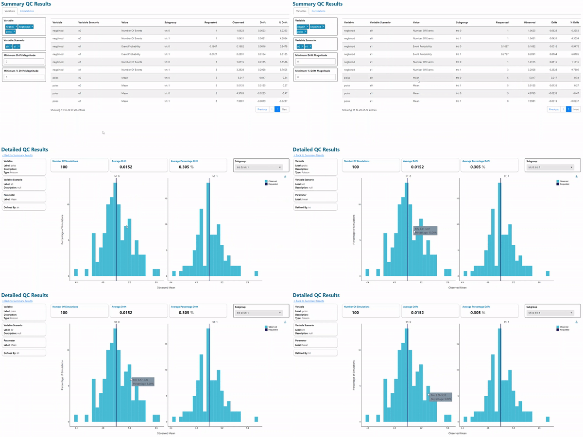
Use of selectors allow for displaying sub-specific data of interest
Where can interactive visualisations impact clinical development?
There are lots of great examples where interactive visualisations and dashboards have improved decision-making for clinical development.
- Prior to study start – when designing studies, project teams have a huge number of competing considerations with regards to balancing the trade-offs between likelihood of success, time, and costs. There is never one perfect answer to what is the optimal study design and various stakeholders often have different perspectives on the benefit-risk of alternative designs. Interactive visualisations play a pivotal role in enabling transparent discussions to compare options which supports effective and efficient decision-making.
- During a study – continuous monitoring of site metrics and information including instream data monitoring and identification of potential issues in real-time. There is a whole area related to risk-based monitoring which utilises interactive visualisations to identify, assess, monitor, and mitigate risks that could affect the quality and safety of a study. This ultimately leads to a better study in terms of fewer errors, lower cost, better analysis, and more timely results.
- Reporting of a study – an interactive visualisation can be used to display the same information as 10s of static tables, listings, or figures. By replacing these types of reports with dashboards to relay results increases efficiency and improves productivity. It also assists ad-hoc analyses where exploratory questions can quickly and easily be investigated.
- Publications – There have been several electronic journals which present data in an interactive way instead of traditional static visuals. This enables a richer and more effective communication of information to the community. Similarly, interactive tools are now being developed to support clinicians in deciding which treatment to administer to patients based on predictive analyses and risks factors. This is changing the treatment paradigm and facilitating a more data driven approach to decision making in this setting.

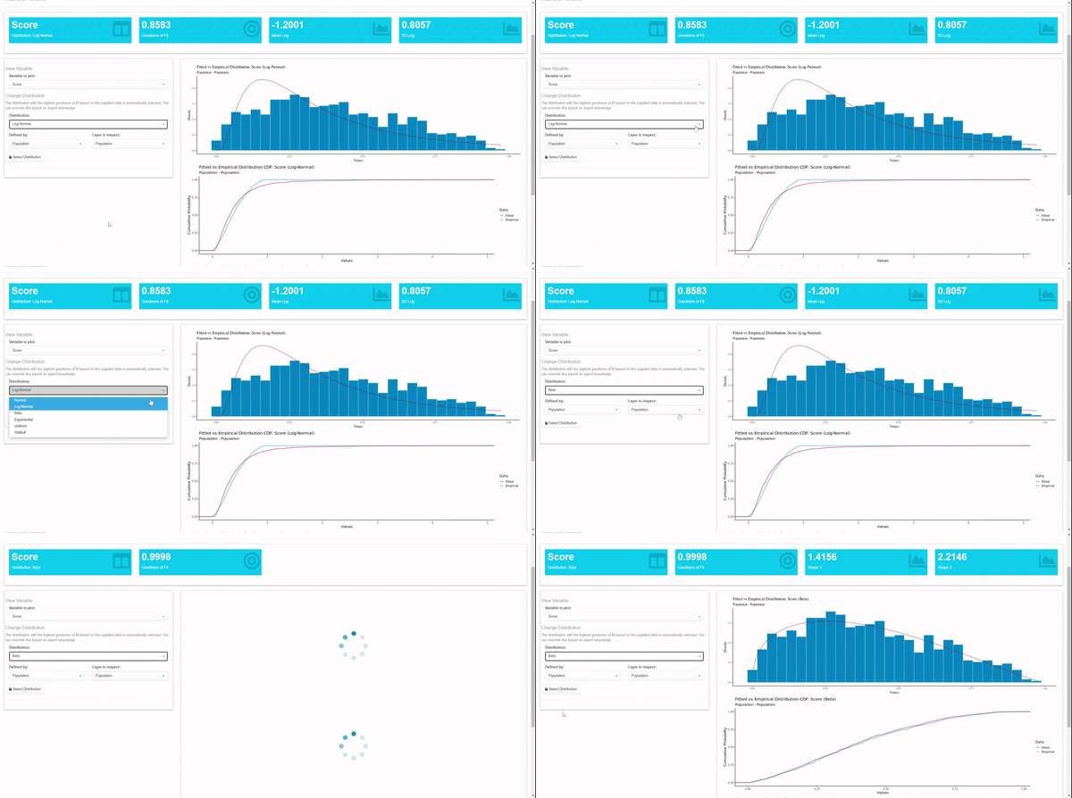
Drill down plots allow the user to explore identify and explore casual factors at different granularity
Deepening multi-disciplinary engagement during key development decisions
Everything in life is becoming more personalised and people want to be able to have control over what they see. They want to be able to explore and adjust, not just read and digest. By scrolling, clicking, and moving the curser over interesting data points, the users of interactive dashboards are engaged at a deeper level rather than a passive viewer alone.
Within the healthcare sector, this is especially vital as clinical trials are becoming more complex and dynamic visualisations offer opportunities to simplify the decision-making process. By collating disparate information into a straightforward visual format accessible for all stakeholders (e.g., clinical, operational, statistical, regulatory and commercial), it is possible to communicate and then leverage complex data-driven insights into effective tangible actions.
Highly informative yet simple to share and review, interactive visualisations provide a powerful tool that can help unleash the full potential of healthcare data. Offering a future of more effective and collaborative decision-making, its use can support increased development efficiency to deliver innovative healthcare solutions faster for patients.

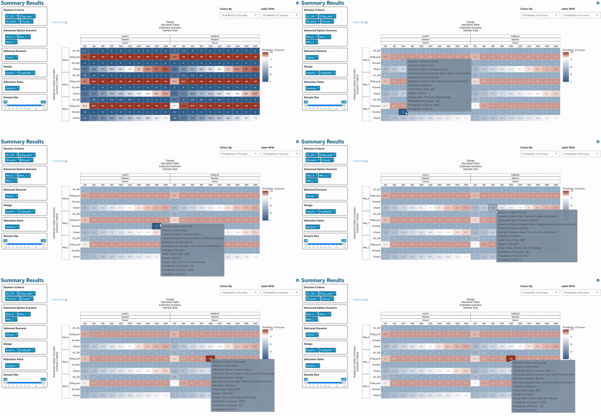
Example of tooltips to provide additional information on hoover for data of interest whilst keeping plots svelte
Read more:
Revolutionising clinical trial design with in silico studies using synthetic data
Shifting the development paradigm with innovative trial design
Statistical Consulting Services
Watch more:


